How Neil Patel copied my design and I’m not even mad
Back in 2019, the Keyword Surfer Chrome extension was brought to life.
Our free SEO tool got excellent traction fast — just after seven months, we have 100k+ people using it for their SEO.
People raved about Keyword Surfer from the day one, and in April 2020, we introduced the second version of the tool.

Is this all a great validation of our work? Yes, definitely.
The fun part is: I was the only one who coded and designed the first version of Keyword Surfer that attracted the first 60k users. Me. Developer at my very core. It looked okay-ish, but you could tell it wasn’t touched by a real designer.
You cannot imagine how shocked, surprised, and kind of amused I was when I noticed that someone took great inspiration from my work and created an extension that could be easily confused with Keyword Surfer… its first version to be specific.
Yesterday I stumbled upon a blogpost announcing Ubersuggest Chrome Extension, and I could hardly believe my own eyes.
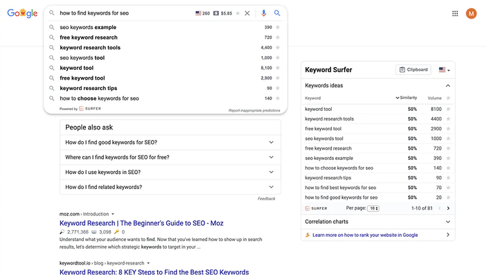
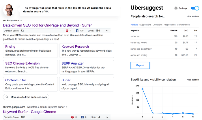
I was staring at the screenshot showing the tool, which was literally how Keyword Surfer looked like in its previous version! See it for yourself:


Apart from some visual details (colors, typography), it’s an extremely close look-alike!
Now, don’t get me wrong. I don’t claim that placing data directly in Google results was my idea. There are other extensions out there that enrich Google’s results with data. Many of them were created before Keyword Surfer.
BUT THIS!
A grey bar under each page title in search results with data. Backlink and visibility correlation charts on the right. Turn on and off switch. Settings placement. It looks like a freaking clone!
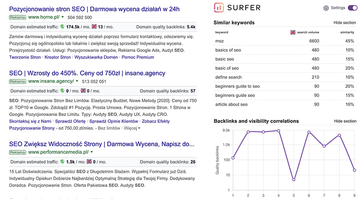
I can see how, in many ways, Neil Patel’s extension is better than Keyword Surfer 1.0, which proves they didn’t just brainlessly copy our work. (Fortunately, Keyword Surfer 2.0 is better in many ways than Neil Patel’s tool as well 😉)
And while I feel surprised… I am not mad at all.
As I mentioned, I don’t have a lot of UI/UX design experience — I’m a developer who just wears a lot of hats as a startup co-founder. If such a successful entrepreneur releases a tool that closely mimics my design, it means it’s not that bad at all!
In fact, it’s not the first time someone “took inspiration” from something I’ve designed. And I’m okay with that. If anything, it proves that it’s a good design, and I feel really flattered when it happens.

“Is it okay?”
If you asked me if it was okay to copy the look and feel of other tools like this, this would be my answer:
Personally, I wouldn’t do that. Not because it’s fair or not. Those who decided to copy our design, made a business decision basing on fragmented information.
We implemented those designs months ago, when we were a really small team, with no designer on board. We knew we would iterate the interface as soon as it is possible. We collected little to no feedback before the release. As we have been flooded with feedback, Keyword Surfer 2.0 was born — based on data and real needs of real people.
When you copy someone’s design (or work in general), you don’t know the process that led to this design. And truth to be told, our process was focused on fast delivery while having no real designer on board.
So I’m not mad that Neil Patel copied my design. I am just endlessly happy Keyword Surfer 2.0 looks as cool as it does.
